

That Retro Logo Would Cook Today for the Miami Marlins!
The Miami Marlins Need to Stop Playing and Bring Back the Teal
The Florida Marlins changed their name to Miami…and though Florida Marlins sounds toughhhhh (like that’s just a cool ass name), they’re now the Miami Marlins.
And I’m not even mad at the change, we never were.
Because if you’re gonna claim the 305, if you’re gonna take the city name, if you’re gonna sit in a brand new ballpark with Miami all over the walls, then cool… rep it.
But that’s the point.
If you rep the 305, then it’s time you have a logo that actually reflects it.
Because the Marlins been going through this whole identity thing for years. Like they’ve been trying to find themselves the way somebody who moved to Brickell last month tries to find “their vibe.” You know what I mean?
They’ve been experimenting. Trying stuff. Testing colors. Changing fonts. Dropping logos like mixtapes that nobody asked for.
When the Marlins first tried getting the M, when they released the block letter “M,” it was… hit and miss.
But if we being real?
It was more miss than hit.
The colors felt off. The vibe felt confused. Like they wanted to be Miami so bad but were scared to fully step into it. Like they had one foot in “Florida” and one foot in “new era branding.” And when you do that, you end up looking like you got dressed in the dark.
But it was ok. It was survivable.
And honestly since they rebranded again, it’s been wayyy better. Like no exaggeration, it’s been 7 or 8 out of 10 better. Cleaner. Stronger. More modern.
BUT…
Here’s where the people speak. Here’s where the fans start leaning back in their seat like… wait a minute.
If You’re Gonna Be “Miami,” Then LOOK Like Miami
Because even with the improvement, a lot of us including myself are like…
Why not go full Nelson and bring back the fish?
Like I’m serious.

We already call them that anyway.
Nobody says “the Marlins” with the same energy as they say THE FISH.
That old school Marlins logo fish was perfect. Perfect. It was clean, it was loud, it was unique, it was instantly recognizable. It wasn’t generic. It wasn’t safe. It wasn’t trying to look like every other MLB team that paid some design agency $400K to give them a minimalist letter.
The fish logo was a mood because they already had a classic.
Most teams would KILL for that. Most teams spend 50 years chasing “iconic.” The Marlins already hit it.
So now, it’s time to reclaim that old school fish and fuse it with the M.
Put the fish behind it.
Wrap it around it.
Make it look like the M is being carved out of the ocean.
That would look epic. And not just “nice.”
I mean epic epic.
That would look like the Marlins finally became what they were always supposed to be.
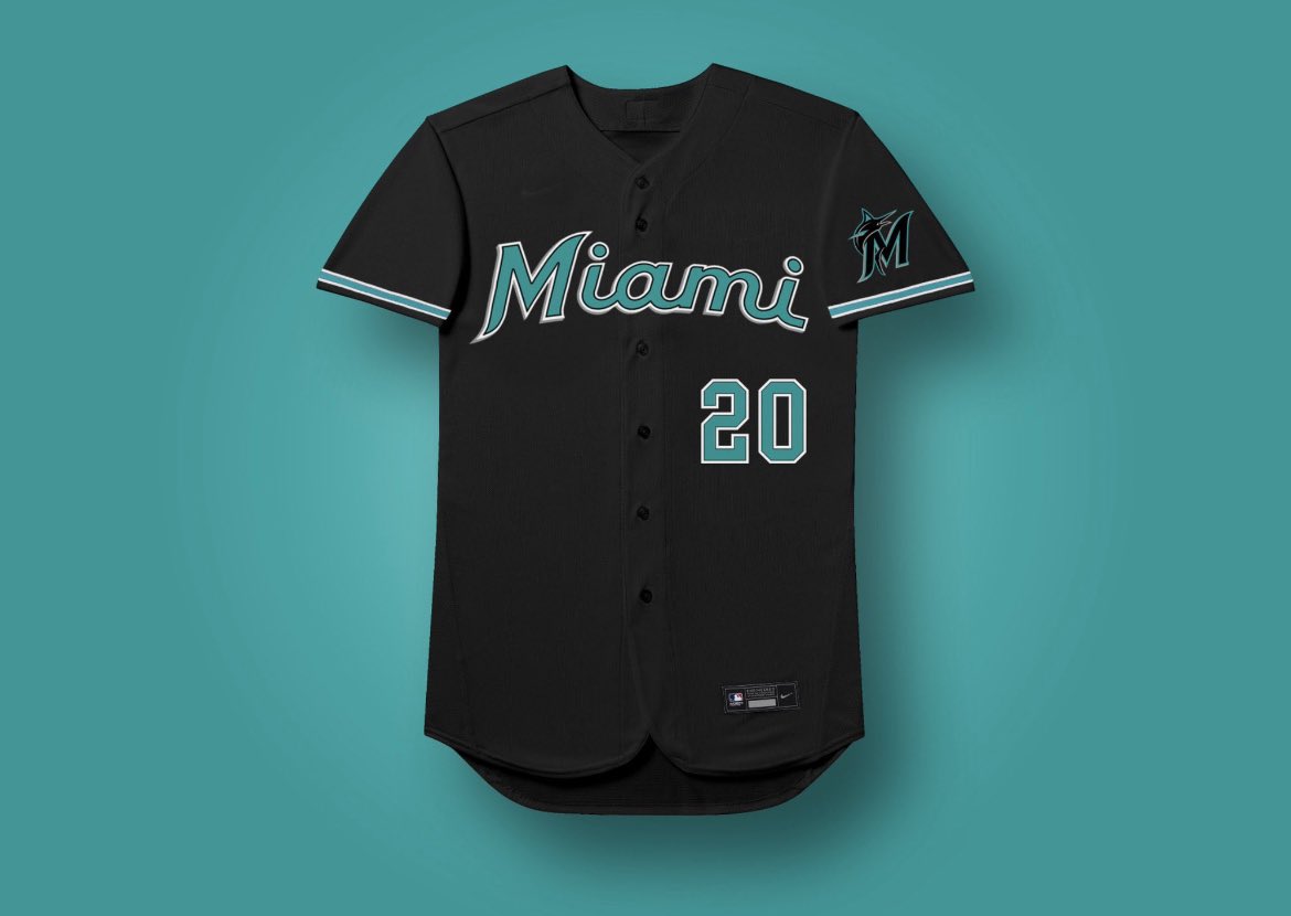
Bring Back the Teal & You Bring Back the Soul
And then if you really wanna make Miami fans emotional?
If you really wanna make grown men start telling their kids stories?
Bring back the jersey color too.
Bring back the one we ALL fell in love with.
Bring back that teal, that aqua, that South Beach, “this team belongs in this city” color.
Because let’s not forget…
The Marlins didn’t become a brand because of 10 straight playoff runs.

They became a brand because they were different.
They became a brand because they were flashy, weird, unpredictable, and lowkey violent when it mattered.
They won World Series.
Twice.
And they made the Yankees look like the dumbest team on earth for fucking with the fish.
That’s history.
That’s lore.
That’s South Florida sports mythology.
And the craziest part is this: when you think of Marlins greatness, you don’t think of the bland rebrands. You don’t think of the generic logos.
You think of fish.
You think of teal.
You think of October nights where Miami looked like the center of the baseball universe for 5 seconds, and it was enough to create a legend.
So yeah, the new branding is better.
But it still feels like we’re one move away from perfection.
One real swing away.
One bold decision away.
Because Miami doesn’t do “safe.”
Miami doesn’t do “plain.”
Miami doesn’t do “almost.”
Miami does full flavor.
Miami does neon.
Miami does arrogance with art.
So if you’re gonna be the MIAMI Marlins, then stop playing around.
Bring back the fish.
Bring back the teal.
Make the logo match the city.
